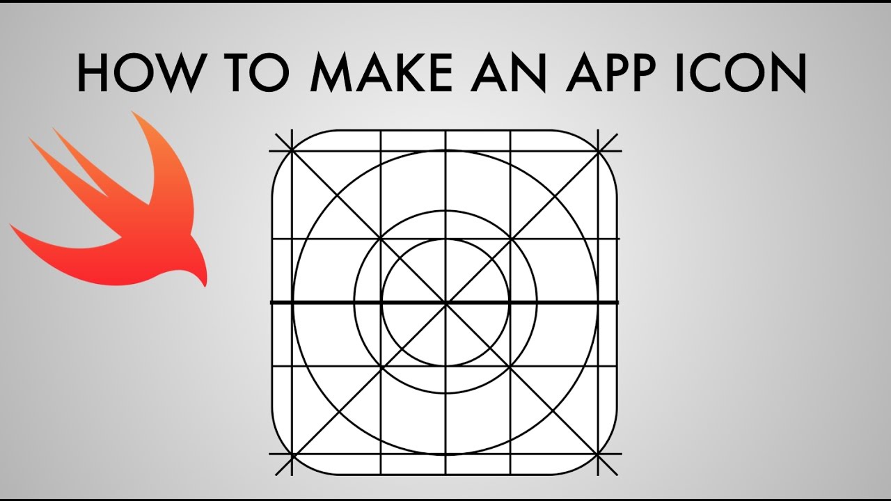
One of the major factor that influences buyer to download the app and increase app ranking factor is visuals of app ( of what app looks like ) . On the basis of the quality of the visuals have been displayed on app page , user will take the decision of either downloading it or rejecting it .
So visuals should be designed in such a way that it imprints a remarkable dot in users mind . When we are talking about visuals it includes app logo , screenshots of the apps , introductory video and more .
Undoubtedly from all of the above visuals elements of your app , app icon plays an important role . Your app icon will make the whole impression of your app when your user first see the app . The attractive app icon is known to be the one which is unique with high end graphics , easily recognisable and at the same time communicate the core functionality of the app . And that is the path that we follow for all our mobile app development projects .
Let’s quickly look at few of the tips that can help you in optimisation of your app icon and increases number of downloads .
Making App Stand Out Of Crowd
Thinking of creating a design that should come from heaven and will have the capability of storing thousands of heart . This is not as simple as that.
If you actually want to be shine on the top of the mountains where millions are already present , then keep in mind it is not an easy task . You have to choose the perfect combination of colour scheme and design in a way that it stand out and at the same time reflects your brand . Sounds hard , doesn’t it ? It actually is .
Don’t go messy with app design that may deliver an unpredicted result . So make it simple with denoting your purpose of app .
Go For Minimal Design
Adding to many elements on app icon will not impress user . As per Winklix approach , making combination of max 2 or 3 colours to design an app logo is always advisable . Always try designing an app logo that denotes your purpose of your mobile application with minimum elements possible .
Keep Logo Design In Accordance With Branding
When we are talking about branding , users are getting emotionally and physically attached with your brand for all their needs that your brand fulfils . Your app icons must so the same .
Your app icon colour combination and taste should go with your brand . If you are in process of developing your brand then always keep in mind to use the same colour scheme in both website and app in order to emotionally connect with the user . Once you have made a stronger connection , user will be able to easily find you .
Always Make Sure It Is Scalable
Your app will be represented in the App Store in various places of which your app icon will be shown in different sizes according to the needs . So always design your app icon inn a sense that it looks great in app shape and sizes .
Usually it has been seen that app which has been loaded with too many elements usually looks awkward when app icon is usually seen tiny .
App icon is probably the very first thing that our mobile app developers do even before conceptualising your app icon .
Testing With Different Backgrounds
Usually user have their own personalised themes with different colour combination installed in their phone . So always keep in mind to give your app icon a colour combination that would look fine with majority of colours .
Testing your final app design is important process , so always handle with care the app UX and design .
Conclusion
So your app icon should be most eye catchy one as it will denotes the entire business existence of your App Store design. Always design your app icon keeping in mind the user choice which can convenience user to try your app . To design your next mobile app development project , consult Winklix , the leading mobile app development company .


